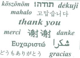
In general, this is often a challenge for graphic designers. For example, texts in English and Chinese are usually the shortest, thus, the translation from those languages will be longer than the original content, sometimes to an alarming degree.
It is believed that the shorter the original message, the longer its translation. Consider some examples:
– FAQ (English) – Perguntas freqüentes (Portuguese) – Preguntas frecuentes (Spanish).
– Log In (English) – abmelden sich (Germany) – Inicie sesión (Spanish) – identifiant (French)
Some factors that may complicate the distribution of the text after translation are:
* Compound nouns: some languages like Finnish, German, and Dutch create long words to replace a sequence that in a different language is formed by multiple words.
* Character width: Korean, Japanese, Chinese, and other languages, often have more complex characters from the Latin language. This means that although the number of characters is the same, it will require more horizontal space.
* Height of characters and line: It is common that texts that come from a language not deriving from Latin, the characters are taller.
(Spanish version: https://www.trustedtranslations.com/el-tamano-del-texto-en-una-traduccion-2010-10-04.html)


